Proposition: Abortion clinic availability is linked to a decrease in abortion rates
FOR the Proposition
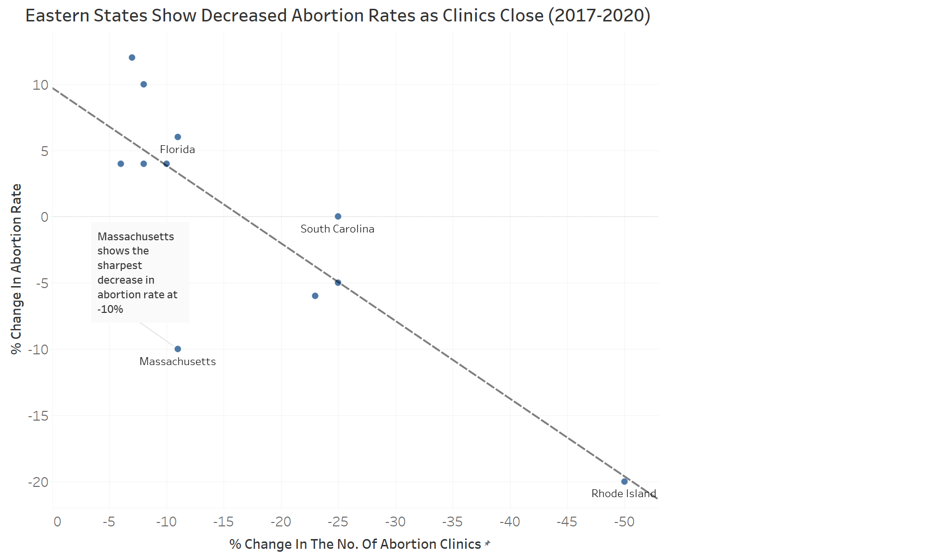
Design Decisions and Rationale:
- Reversed x-axis: this is somewhat truthful in the sense of showing a decrease. The goal here was to highlight the decrease in abortion rates. By changing the perspective of decrease to be the "positive" x-direction the negative association is more quickly made. We considered flipping the y-axis instead. This did produce a trendline with a similar slope, but the decrease was not as obvious after taking a closer look at the axes. (Score = 0.5)
-
Eastern States Datapoints: Only Eastern states with a net removal of abortion clinics were shown. The goal here was to find some general
US region that shared a similar change over the 3 years. This plot involved a bit of cherry picking as we tested
all cardinal directions and this subset had the most obvious trend with three "clusters" (Rhode Island isn't really a cluster,
but it follows the trendline closely). After selecting these Eastern states we further subsetted for states where
abortion clinics in the state decreased. We considered including all US states and not subsetting by region,
however this trendline wasn't as convincing due to the cluster of states around x=0 which had a net change of 0 abortion clinics
and varying changes in abortion rates.
(Score = -2)
Eastern states grouping (not all were plotted once subsetted for a decrease in clinics): Maine, Vermont, New Hampshire, Massachusetts, Rhode Island, New York, Connecticut, New Jersey, Pennsylvania, Delaware, Maryland, Virginia, West Virginia, North Carolina, South Carolina, Georgia, and Florida. - 3 Year Period Reporting: The change reported is over a specific 3 year period which may not reflect larger trends across different presidencies. We chose 2017-2020 as opposed to other years as this time frame included the start of a president who brought new ideas on abortion policy. Since the changes were (nearly) across Trump's entire term, this seemed to be a good indicator of the immediate impact of his policies. (Score = 1)
- Distance between x vs y-ticks: When setting our axes we increased the gap between y-ticks and decreased the gap between x-ticks. This elongated our slope, indicating there was more of a decreasing relationship than actually occurred. While we didn't directly manipulate any individual tick spacing (i.e. using different proportions for different tick ranges), we changed how the trendline/data points might be interpreted at glance. (Score = -0.5)
AGAINST the Proposition
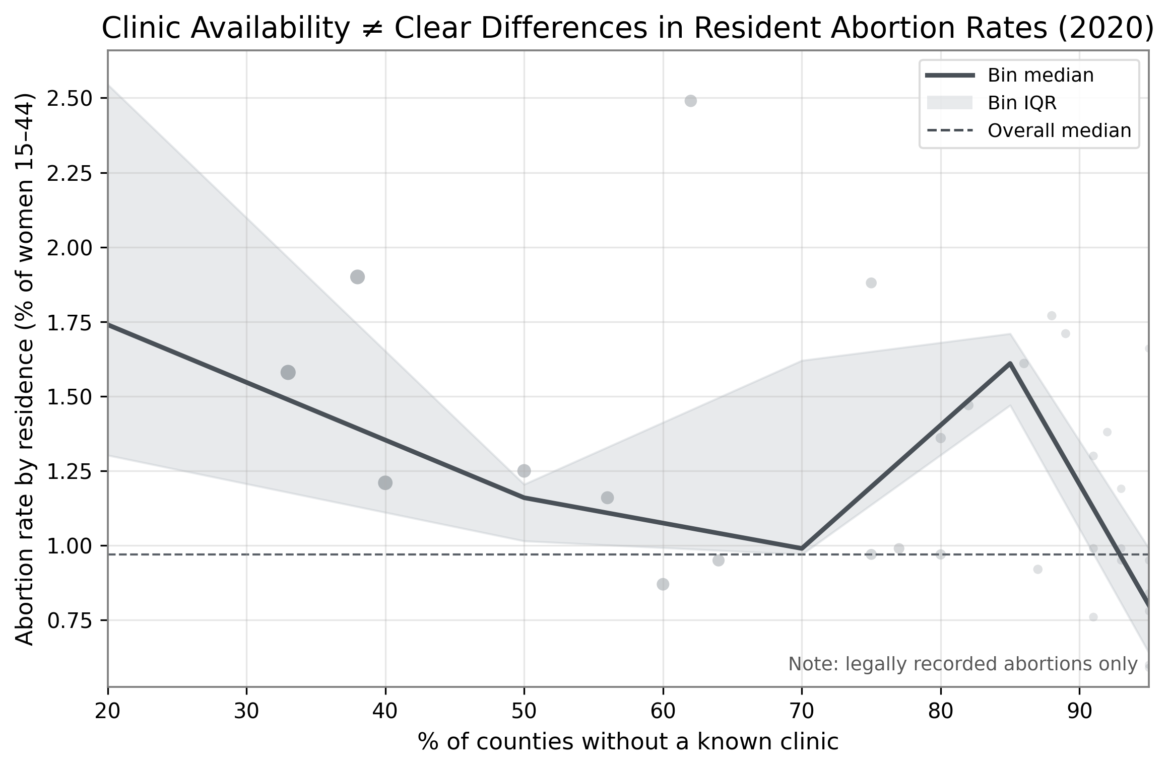
Design Decisions and Rationale:
- Summarize with 5 bins; show connected bin medians + IQR ribbon. We partition the x-axis (% of counties without a clinic) into five fixed ranges, then plot each bin's median resident rate and its interquartile range. Connecting the medians creates an easy-to-follow 'profile line', while the ribbons communicate spread without exposing every outlier. This reduces overplotting near 90–100% and subtly centers attention on central tendency rather than extremes. (Score = -0.5)
- Fade and shrink raw points as access scarcity increases. Because many states cluster at high "no-clinic" percentages (due to clinics concentrating in metro counties), we gradually decrease point size and opacity as x→100%. This keeps the background context visible but visually subordinate, so readers anchor on the summarized medians/ribbons instead of potentially contrary individual states in the bottom-right cluster. (Score = -2)
- Tighten the y-axis to the IQR envelope and clamp x to bin bounds. We set the vertical limits just beyond the combined IQR band and restrict the horizontal range to the five bins in view. This removes empty margin, increases the apparent overlap of the ribbons, and visually compresses differences between bins—supporting the claim of “no clear separation” while still staying within a plausible scaling choice. (Score = -1)
Final Reflection
Throughout this project we always tried to throw out a wide net for exploring different visualization options. From there
we refined our design choices and combined aspects from different prototype plots to improve our final plots. It was (relatively) straightforward
to tease out potential deceptive ideas to use in the data, yet it was more difficult than expected to come to a
consensus on aspects, as we all had different ideas on what would be more useful as a deception. It was a bit
surprising how each team member had different stylistic choices when plotting. Even though we all have the same access to
the material for this course, we emphasized different parts of our plots that seemed aligned with different backgrounds
(e.g. psychology, statistics).
We learned that small, defensible choices can strongly shape perception even when the underlying relationship is weak.
For the against view, binning the access variable and showing connected medians + IQR bands emphasized overlapping
central tendencies, while a tighter y-range and faded raw points near 90–100% guided attention away from dense,
potentially contrary individual states. Ethically, we disclosed scope ("legally recorded abortions only") and labeled the summaries,
but we recognize that connecting medians and compressing the scale are persuasive choices that can downplay within-bin variance.
For the supporting view, altering the tick spacing across axes made the decreasing trend more pronounced than it actually was,
while cherry picking a specific region of states that best matched their trendline. Alongside that, reversing the x-axis helped the viewer
notice the decreasing trend more easily. Ethically, all of these were labeled in the plot, but their combined effect can be
underestimated on the data visualization trend.
Drawing bounds between acceptable and misleading persuasive choices seems to be clear cut or fairly blurred. There
are some obvious choices for acceptable choices, such as simple titles/labels/most choices that reduce the cognitive load of the viewer.
On the other hand, deceptive choices require cognition to recognize. Our "against" plot was obscured in this manner as
you had to think about how to interpret the plot since your intuition may have been subverted as a viewer. Our supporting
plot misleadingly emphasized a trend via subsetting the data and altering axes perceptions, but reduced cognitive load via reversing the x-axis
to make the trend more obvious. A possible ethical bound could be that all transformations from raw data must be clearly stated, along with their potential impact on interpretation.